Wednesday, October 23, 2013
Graphics in Video Games: Dragon's Crown
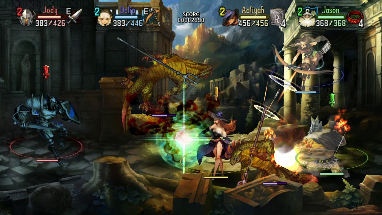
Dragon's Crown, an co-op action role-playing game made by Vanillaware and Atlus (the ones who also made Odin Sphere), was so far a great game. You basically play as one of the six characters, and you go through different levels in the game (through quests), either alone or with CPUs or other players. And to compare, it's similar to the gameplay style of Dungeon & Dragons and Golden Axe, with some differences. The thing I liked about the game, besides the gameplay, was the paint-like look of the entire game. Just like Odin Sphere, everything looked vibrant (and sometimes ominous), from how the scenery looked to how the graphics were animated. I wonder how long it took the designers to design all of the things in this game? Another question to be unanswered, until later...

Sunday, October 13, 2013
How NES Box Art Were (In my Opinion)
From what I saw (through the internet), most NES box art look realistic, or, in other words, bad-ass. It looks like the art would be for a cover of some "epic", action-packed movie, but probably back then, it was a way to represent what the game is (or to mainly get consumers to buy the specific game). To contrast, Super Mario Bros. had a simple box art showing Mario's sprite in it, which gives the idea of what the game will look and might be like. For Ninja Gaiden, however, its box art shows a ninja with a burning city in the background, representing how awesome the game will be, but not what it will look like in the game. So basically, Super Mario Bros.'s box art sticks with the spirit of the graphics itself, while Ninja Gaiden's box art went to more of a movie look to make itself more appealing to the consumers. I'm not saying they're bad, just that some bad-ass box art were too emphasized. But, I do like them though. I guess it was a way to get them on the market.


Saturday, October 12, 2013
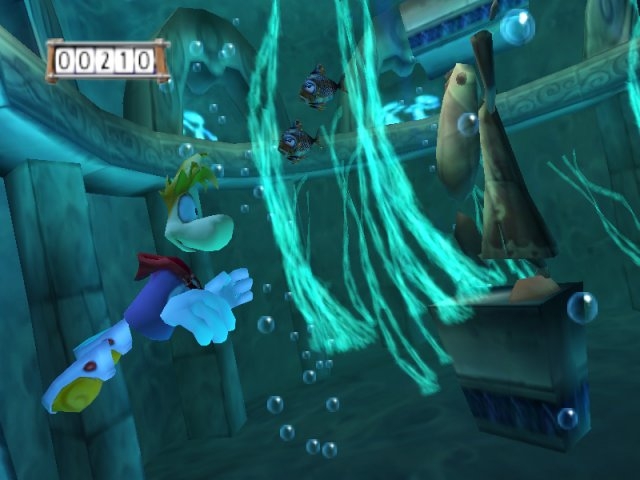
Graphics in Video Games: Rayman
 |
| Rayman (PS1 | Sega Saturn | Atari Jaguar | PC | GBC | GBA | DS |
*Sorry again for how the images are placed
 |
| Rayman 2 (PS1 | PS2 | N64 | Dreamcast | Windows | GBC | DS | 3DS | iOS |
 |
| Rayman 3 (PS2 | PS3 | Xbox | Xbox 360 | Gamecube | PC | N-Gage | Java ME) |
 |
| Rayman Origins (PS3 | Xbox 360 | Wii | PC | PS Vita | 3DS) |
 |
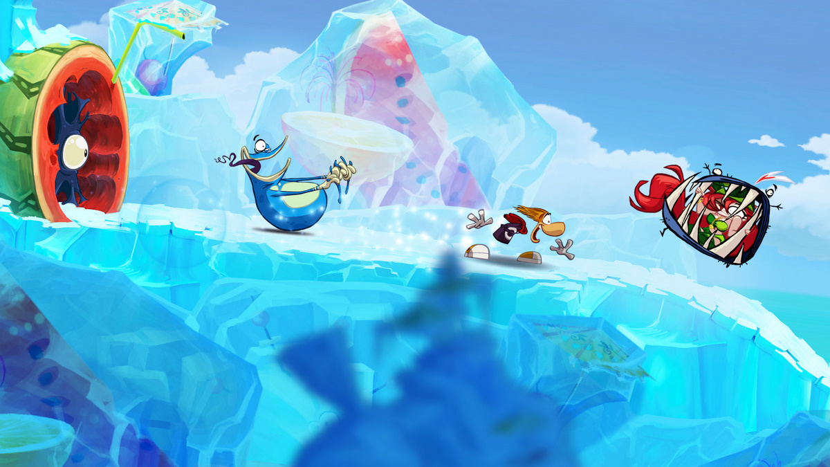
| Rayman Legends (PS3 | Xbox 360 | Wii U | PC | PS Vita) |
Friday, October 11, 2013
Evolution and Reincarnation of Video Game Design
 |
| Super Mario Bros. (NES) |
*Sorry how the images were place
 |
| Earthbound (SNES) |
 |
| Legend of Zelda: Ocarina of Time (Nintendo 64) |
 |
| Portal 2 (PS3 | Xbox 360 | PC) |
 |
| Terraria (PS3 | Xbox 360 | PC | iOS) |
Thursday, October 10, 2013
Graphics in Video Games: Odin Sphere
One of the video games that fascinates me was Odin Sphere for the PlayStation 2. It's a 2D fantasy action RPG video game where you play as characters from 5 different opposing clans while you follow their story. The game is great (even though I didn't beat the game yet), but what was interesting was the design of the entire video game itself. The characters, the scenery, the stages, the enemies, everything looks like it was kind of painted; including the animation was great. The thing is, I wonder how long the game designers took to make all these animations what it is now? Who knows. It's a good game though.


Wednesday, October 9, 2013
What Annoys Me in Certain Compositions of Ads
What annoys me in certain compositions of ads is when a design doesn't portray the product, or it presents something else. The designers do a good job with their designs, but the message sometimes get thrown off. An example was an ad that a classmate showed during a Graphic Design class during the time I was in High School. I couldn't find the ad, but as far as I remember, it was a young woman's head that filled the entire left side of the ad, and her eye was on fire (but she wasn't in pain; it's, of course, fake). I thought it looked like an ad for some kind of make-up, but you want to know what it really is trying to sell? A fireplace. Yep, An ad that presents a fireplace as a product to the young adults. I understand what the ad is doing, but it almost looks like that the fireplace is used to burn your skin or something. The ad just doesn't work.
Subscribe to:
Posts (Atom)