Starting off with Trevor Paglen's One Hundred Pictures, Frozen in Time, Paglen states about a discovery of cave paintings in the Lascaux cave in France during the 1940's, and presents his fascination of what's depicted in the paintings themselves. Whenever he look at the paintings, he goes back and forth on what's being depicted in them; he thinks it could be about a hunt, a ritual, relationship between human and nature, a murder confession, or a visual joke. There was a point Paglen though it might be an artwork made to be shown to those in the far future, to showcase what happen in the artist's timeline (or to think how early humanity would work in the future). Inspired by this concept, Paglen began a project called The Last Pictures, which is having communication satellites to be like "time capsule" filled with picture of his choice; the "time capsules" would then be left for those in the further future to look at the pictures - as if they were "cave paintings" (in context) - and have them learn about what happened to our Earth many years ago.
In Errol Morris's Liar, Liar, Pants on Fire, Morris provides his thoughts on how pictures are important, but can be meaningless if they don't have captions for them (even for old pictures). To be more specific, he states that one would be clueless of what are truly (going on) in the pictures, but one can guess on what/who they are; captions help broaden on what are in the pictures, but one would question if they're true. For example, in the article, there's an old picture of a ship, but by looking at it you can't tell what ship it is. With the caption stating that the ship is the "Lusitania", people will think the ship IS the "Lusitania", but other would think it's something else. The thing is, based on Morris' insight on his topic, context is needed for pictures to better understand what are in the pictures themselves; although, he does state that pictures can never have a "true" or "false" to them.
Monday, August 29, 2016

Wednesday, August 24, 2016
WJT Mitchell's "Word and Image" - Response
In Mitchell's "Word and Image" article, it states, at the beginning, that "words" are important by their meaning, not just by their "construct" of wording or how it sounds when pronounced; words can be considered as "objects of visual or aural attention". The same would go for images, but by what the images could represent; and we gain that knowledge through eyesight (or what philosopher George Berkeley of 1709 would state as the "visual language"). According to modern neuropsychologists like Oliver Sacks, they did confirm that the gaining of knowledge through eyesight is true when they found out that those who were temporary blind for a certain amount of time had to relearn the techniques of "seeing", even if the eyes fully recovered.
Based on what Mitchell described, many of literature scholars like Norman Bryson and Woody Steiner decided to enter the studies of art so they can provide their own ideology towards/on/in art, but art scholars like Thomas Crow didn't want the literature scholars to (I would per say) "change" art since the art scholars think that art is (and this is in context, just to say) in a different "league" than words. However, images can benefit from words to present meaning or what it represents (though it may vary). For example, Mitchell states (in context) that a word can alter even a simple image, like an image of what looks like an arrow to be presented (from a word) as a tree. Although, one would question on the specifics, like what kind of tree is the image. There are other cases that the image could represent something else.
Based on what Mitchell described, many of literature scholars like Norman Bryson and Woody Steiner decided to enter the studies of art so they can provide their own ideology towards/on/in art, but art scholars like Thomas Crow didn't want the literature scholars to (I would per say) "change" art since the art scholars think that art is (and this is in context, just to say) in a different "league" than words. However, images can benefit from words to present meaning or what it represents (though it may vary). For example, Mitchell states (in context) that a word can alter even a simple image, like an image of what looks like an arrow to be presented (from a word) as a tree. Although, one would question on the specifics, like what kind of tree is the image. There are other cases that the image could represent something else.
Friday, December 6, 2013
Best Mario Game So Far: Super Mario 3D World
 I recently got Super Mario 3D World for my Wii U last week, and dang, it's best Mario game by far. Just like Super Mario 3D Land, it's basically a combination of Super Mario 64 and Super Mario World where you try to reach each flagpoles as you travel through 3D levels. The game was also interesting that the creators of the game put in Co-op in it; can't have a game without your friends and family playing along! The one thing that surprised me the most is how the game looked. The level design was great, but the graphics made it whole. I mean, these graphics looked so vibrant and colorful that it just fits the Mario atmosphere. All together, Super Mario 3D World is the best Mario game so far. Now, I wonder when Nintendo will come out with the next Super Mario Galaxy...
Wednesday, November 13, 2013
Mario in Space (Super Mario Galaxy)

Super Mario Galaxy was one of the best Mario games I've played in a long time (after Super Mario Sunshine). It's gameplay controls feels somewhat the same (but you use the Wii Remote and Nunchuck, however), but the game in general was fantastic. The worlds within the game were just beautiful, and the graphics just fits for this Mario game. I almost forgot about the music; it was the best. I would say the sequel was good as well, but personally, I favor the first one a little more.
Wednesday, October 23, 2013
Graphics in Video Games: Dragon's Crown
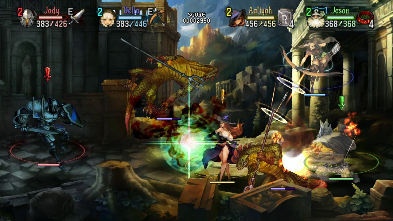
Dragon's Crown, an co-op action role-playing game made by Vanillaware and Atlus (the ones who also made Odin Sphere), was so far a great game. You basically play as one of the six characters, and you go through different levels in the game (through quests), either alone or with CPUs or other players. And to compare, it's similar to the gameplay style of Dungeon & Dragons and Golden Axe, with some differences. The thing I liked about the game, besides the gameplay, was the paint-like look of the entire game. Just like Odin Sphere, everything looked vibrant (and sometimes ominous), from how the scenery looked to how the graphics were animated. I wonder how long it took the designers to design all of the things in this game? Another question to be unanswered, until later...

Sunday, October 13, 2013
How NES Box Art Were (In my Opinion)
From what I saw (through the internet), most NES box art look realistic, or, in other words, bad-ass. It looks like the art would be for a cover of some "epic", action-packed movie, but probably back then, it was a way to represent what the game is (or to mainly get consumers to buy the specific game). To contrast, Super Mario Bros. had a simple box art showing Mario's sprite in it, which gives the idea of what the game will look and might be like. For Ninja Gaiden, however, its box art shows a ninja with a burning city in the background, representing how awesome the game will be, but not what it will look like in the game. So basically, Super Mario Bros.'s box art sticks with the spirit of the graphics itself, while Ninja Gaiden's box art went to more of a movie look to make itself more appealing to the consumers. I'm not saying they're bad, just that some bad-ass box art were too emphasized. But, I do like them though. I guess it was a way to get them on the market.


Saturday, October 12, 2013
Graphics in Video Games: Rayman
 |
| Rayman (PS1 | Sega Saturn | Atari Jaguar | PC | GBC | GBA | DS |
*Sorry again for how the images are placed
 |
| Rayman 2 (PS1 | PS2 | N64 | Dreamcast | Windows | GBC | DS | 3DS | iOS |
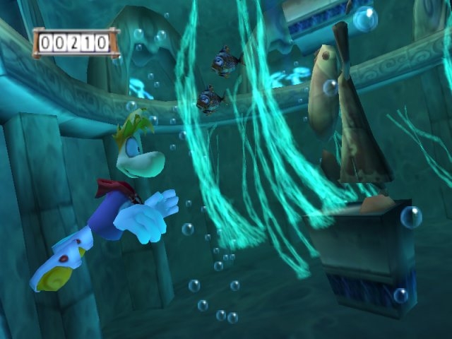 |
| Rayman 3 (PS2 | PS3 | Xbox | Xbox 360 | Gamecube | PC | N-Gage | Java ME) |
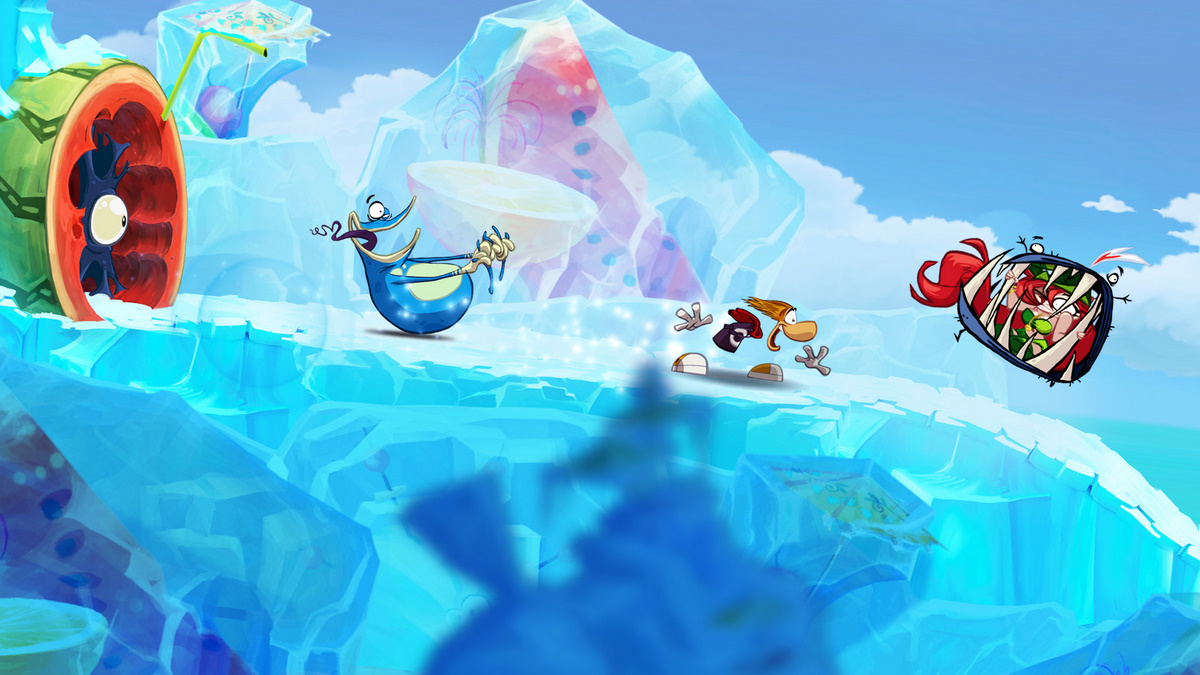 |
| Rayman Origins (PS3 | Xbox 360 | Wii | PC | PS Vita | 3DS) |
 |
| Rayman Legends (PS3 | Xbox 360 | Wii U | PC | PS Vita) |
Subscribe to:
Posts (Atom)